There’s a common joke that a data scientist is someone who knows more statistics than a computer scientist and more computer science than a statistician. (Whether or not it’s funny is up for debate.) Like all good jokes, though, it contains a kernel of truth. Some data scientists resemble statisticians who happen to code, while others look more like software engineers who dabble in analytics. Some are cutting-edge machine learning experts, while others focus primarily on business reporting or experimentation. There are PhDs with lengthy publication lists, and there are practitioners who have never opened an academic paper. In short, “data science” is notoriously hard to pin down, because almost any definition risks excluding someone who legitimately practices it.
Still, the attempt at definition is worthwhile. At its core, we can say that data science is about extracting insight from messy, real-world data. The people who do this go by many titles—data scientist, data analyst, machine learning engineer, statistician, or business intelligence analyst. Even software engineers, researchers, and domain experts frequently find themselves doing the work of data science, whether or not it appears in their job description.
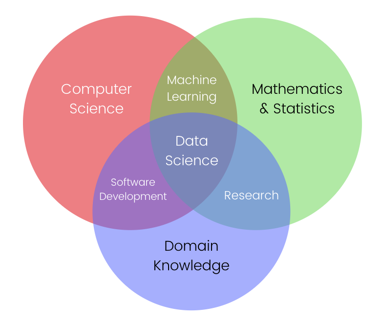
Venn diagram showing overlap of skills in Data Science
The first diagram helps explain why data science is so difficult to define. It shows that data science sits at the intersection of computer science, mathematics & statistics, and domain knowledge. A successful data scientist combines all three: they need programming and software skills to manipulate data at scale, statistical and mathematical understanding to interpret results rigorously, and domain expertise to make those results meaningful in context. Add in machine learning, and you see how easily the field overlaps with multiple other disciplines.
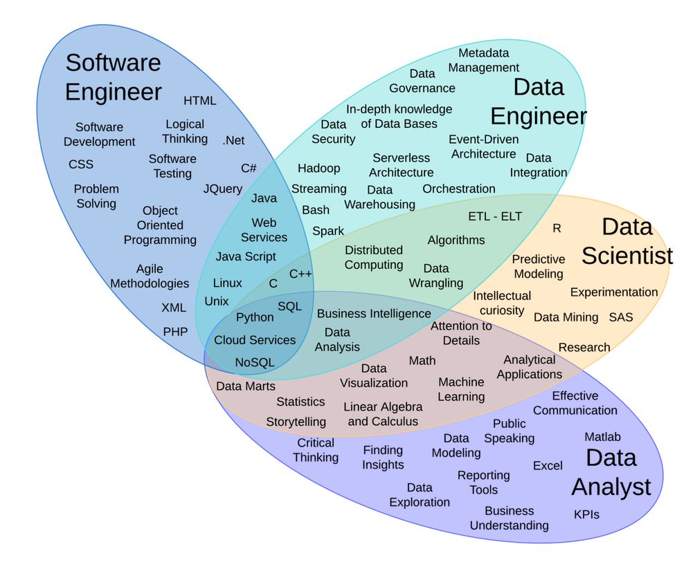
Venn diagram showing overlap of skills in Data Roles
The second diagram adds further clarity by mapping how different data-related roles emphasize different skill sets. Software engineers lean toward programming and system design, while data engineers focus on databases, pipelines, and scalable architectures. Data analysts center on reporting, visualization, and business understanding. Data scientists, meanwhile, sit in the overlap: they must balance coding ability, mathematical rigor, and communication skills to bridge technical work with actionable insight.
This overlap also underscores another key truth: data science is collaborative by nature. No one person masters the full breadth of skills in both diagrams. Data scientists usually work closely with engineers, analysts, domain experts, and business stakeholders. Technical proficiency alone is not enough—effective communication, critical thinking, and teamwork are equally essential to transform raw data into decisions that matter.
In this sense, data science is best seen not as a rigid job title, but as a mode of problem-solving that blends disciplines. The diversity of backgrounds among practitioners isn’t a weakness—it’s the very thing that makes the field so dynamic and impactful.
1.1.1 Methodology of Data Science
The data science process is an iterative and interdisciplinary workflow that transforms raw data into actionable knowledge. While the exact steps may vary depending on the project, industry, or team, the process generally includes the following key stages:
Problem Definition: The process begins with a clear understanding of the problem to be solved or the question to be answered. This step often requires close collaboration with domain experts and stakeholders to ensure the problem is framed in a way that is both meaningful and solvable with data. A poorly defined problem can derail the entire process, making this stage critical.
Data Collection: Relevant data must then be gathered from diverse sources, which may include relational databases, APIs, web scraping, sensors, surveys, or third-party datasets. At this stage, considerations such as data accessibility, privacy, and quality play a major role in determining the project’s feasibility.
Data Cleaning and Preprocessing: Raw data is rarely analysis-ready. This step involves addressing missing values, correcting inconsistencies, removing duplicates, and transforming variables into usable formats. Depending on the project, preprocessing may also involve scaling, normalization, text parsing, or image transformation. High-quality preprocessing is essential, since poor data hygiene undermines all subsequent stages.
Exploratory Data Analysis (EDA): Before formal modeling, data scientists perform EDA to uncover structure, detect anomalies, visualize distributions, and generate initial hypotheses. This step combines statistical methods, visualization tools, and domain knowledge to shape an intuitive understanding of the dataset and guide later decisions about modeling.
Feature Engineering: Raw data rarely contains all the information needed for predictive modeling. Data scientists therefore create new variables or transform existing ones to capture relevant patterns. Examples include aggregating time-series signals, encoding categorical variables, or constructing interaction terms. Good feature engineering often determines whether a model succeeds or fails.
Model Selection and Training: With features prepared, data scientists select suitable algorithms based on the problem type (classification, regression, clustering, etc.), the data structure, and performance trade-offs. The chosen models are then trained on the dataset, often using cross-validation to tune hyperparameters and prevent overfitting.
Model Evaluation: Trained models must be rigorously evaluated using appropriate metrics, such as accuracy, precision, recall, F1-score, ROC-AUC, or mean squared error, depending on the task. Evaluation also includes robustness testing, fairness assessments, and comparisons with baseline methods to ensure the model adds genuine value.
Model Deployment: Once validated, the model is deployed into a production environment where it can generate predictions on new, unseen data. Deployment may involve integrating the model into applications, dashboards, or automated decision systems, often requiring collaboration with software engineers and DevOps teams.
Monitoring and Maintenance: The data science process does not end with deployment. Models degrade over time due to changing data distributions, user behavior, or external factors—a phenomenon known as data drift. Continuous monitoring, retraining, and updating ensure the model remains reliable and relevant.
This cycle is iterative rather than strictly linear. Insights from later stages (such as poor model performance) often lead to revisiting earlier steps (such as redefining features or collecting additional data). Just as the diagrams showed, successful data science requires more than technical execution: it depends on problem framing, communication, domain expertise, and collaboration across multiple roles.
1.2 Fundamentals for Data Scientists
1.2.1 Visualizing Data
A fundamental part of the data scientist’s toolkit is data visualization. Although it is very easy to create visualizations, it’s much harder to produce good ones. There are two primary uses for data visualization: * To explore the data and find patterns, trends, and anomalies. * To communicate results to others.
A wide variety of tools exist for visualizing data. We will be using matplotlib, which is a popular Python library for creating visualizations. It provides a wide range of tools and functions to create various types of plots and charts. To install Matplotlib, you can use pip, the Python package manager. Open your terminal or command prompt and run the following command:
pip install matplotlib
We will be using the matplotlib.pyplot module. In it’s simplest use, pyplot maintains an internal state in which you build up a visualization step by step. Once you’re done, you can save it with savefig or display it with show. For example, making simple plots is pretty simple:
Code
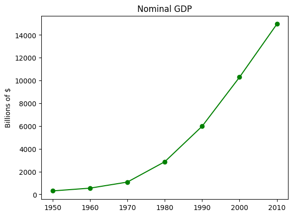
import matplotlib.pyplot as pltyears = [1950, 1960, 1970, 1980, 1990, 2000, 2010]gdp = [300.2, 543.3, 1075.9, 2862.5, 5979.6, 10289.7, 14958.3]# create a line chart, years on x-axis, gdp on y-axisplt.plot(years, gdp, color='green', marker='o', linestyle='solid')# add a titleplt.title("Nominal GDP")# add a label to the y-axisplt.ylabel("Billions of $")# save the plot as a PNG fileplt.savefig('im/viz_gdp.png')plt.show()
Making plots that look publication-quality good is more complicated. There are many ways you can customize your charts with, for example, axis labels, line styles, and point markers. Rather than attempt a comprehensive treatment of these options, we’ll just use (and call attention to) some of them in our examples. Although we won’t be using much of this functionality, matplotlib is capable of producing complicated plots within plots, sophisticated formatting, and interactive visualizations. Check out the matplotlib documentation if you want to go deeper.
Bar Charts
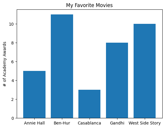
A bar chart is a good choice when you want to show how some quantity varies among some discrete set of items. For instance, the next figure shows how many Academy Awards were won by each of a variety of movies:
Code
movies = ["Annie Hall", "Ben-Hur", "Casablanca", "Gandhi", "West Side Story"]num_oscars = [5, 11, 3, 8, 10]# plot bars with left x-coordinates [0, 1, 2, 3, 4], heights [num_oscars]plt.bar(range(len(movies)), num_oscars)plt.title("My Favorite Movies") # add a titleplt.ylabel("# of Academy Awards") # label the y-axis# label x-axis with movie names at bar centersplt.xticks(range(len(movies)), movies)# save the plot as a PNG fileplt.savefig('im/viz_movies.png')plt.show()
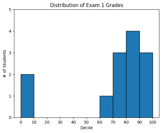
A bar chart can also be a good choice for plotting histograms of bucketed numeric values, as in the next figure , in order to visually explore how the values are distributed:
Code
from collections import Countergrades = [83, 95, 91, 87, 70, 0, 85, 82, 100, 67, 73, 77, 0]# Bucket grades by decile, but put 100 in with the 90shistogram = Counter(min(grade //10*10, 90) for grade in grades)plt.bar([x +5for x in histogram.keys()], # Shift bars right by 5list(histogram.values()), # Give each bar its correct height10, # Give each bar a width of 8 edgecolor=(0, 0, 0)) # Black edges for each barplt.axis((-5, 105, 0, 5)) # x-axis from -5 to 105,# y-axis from 0 to 5plt.xticks([10* i for i inrange(11)]) # x-axis labels at 0, 10, ..., 100plt.xlabel("Decile")plt.ylabel("# of Students")plt.title("Distribution of Exam 1 Grades")# save the plot as a PNG fileplt.savefig('im/viz_grades.png')plt.show()
The third argument to plt.bar specifies the bar width. Here we chose a width of 10, to fill the entire decile. We also shifted the bars right by 5, so that, for example, the “10” bar (which corresponds to the decile 10–20) would have its center at 15 and hence occupy the correct range. We also added a black edge to eacch bar to make them visually distinct.
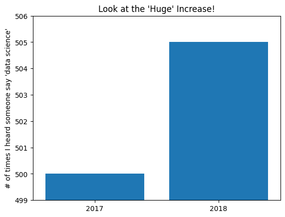
The call to plt.axis indicates that we want the x-axis to range from –5 to 105 (just to leave a little space on the left and right), and that the y-axis should range from 0 to 5. And the call to plt.xticks puts x-axis labels at 0, 10, 20, …, 100. Be judicious when using plt.axis. When creating bar charts it is considered especially bad form for your y-axis not to start at 0, since this is an easy way to mislead people:
Code
mentions = [500, 505]years = [2017, 2018]plt.bar(years, mentions, 0.8)plt.xticks(years)plt.ylabel("# of times I heard someone say 'data science'")# if you don't do this, matplotlib will label the x-axis 0, 1# and then add a +2.013e3 off in the corner (bad matplotlib!)plt.ticklabel_format(useOffset=False)# misleading y-axis only shows the part above 500plt.axis((2016.5, 2018.5, 499, 506))plt.title("Look at the 'Huge' Increase!")# save the plot as a PNG fileplt.savefig('im/viz_misleading_y_axis.png')plt.show()
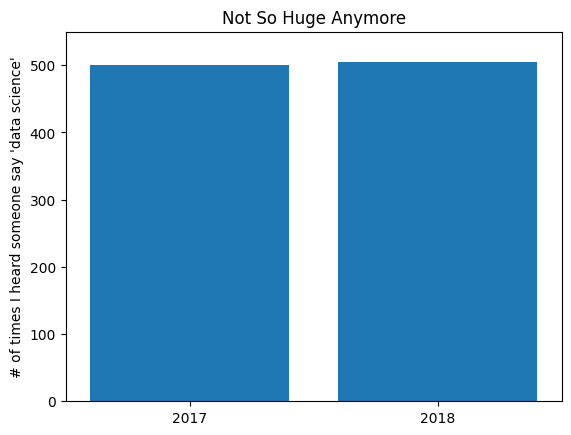
Here we use more sensible axes, and it looks far less impressive:
Code
plt.bar(years, mentions, 0.8)plt.xticks(years)plt.ylabel("# of times I heard someone say 'data science'")plt.ticklabel_format(useOffset=False)plt.axis((2016.5, 2018.5, 0, 550))plt.title("Not So Huge Anymore")# save the plot as a PNG fileplt.savefig('im/viz_non_misleading_y_axis.png')plt.show()
Line Charts
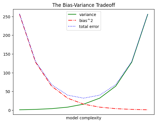
As we saw already, we can make line charts using plt.plot. These are a good choice for showing trends:
Code
variance = [1, 2, 4, 8, 16, 32, 64, 128, 256]bias_squared = [256, 128, 64, 32, 16, 8, 4, 2, 1]total_error = [x + y for x, y inzip(variance, bias_squared)]xs = [i for i, _ inenumerate(variance)]# We can make multiple calls to plt.plot# to show multiple series on the same chartplt.plot(xs, variance, 'g-', label='variance') # green solid lineplt.plot(xs, bias_squared, 'r-.', label='bias^2') # red dot-dashed lineplt.plot(xs, total_error, 'b:', label='total error') # blue dotted line# Because we've assigned labels to each series,# we can get a legend for free (loc=9 means "top center")plt.legend(loc=9)plt.xlabel("model complexity")plt.xticks([])plt.title("The Bias-Variance Tradeoff")# save the plot as a PNG fileplt.savefig('im/viz_line_chart.png')plt.show()
Scatterplots
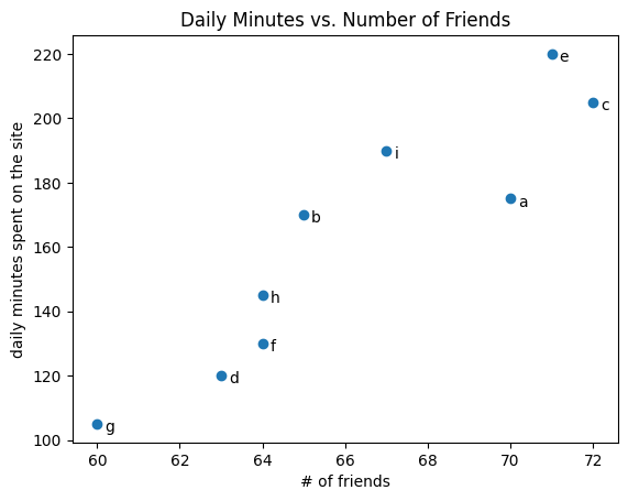
A scatterplot is the right choice for visualizing the relationship between two paired sets of data. For example, the next visualization illustrates the relationship between the number of friends your users have and the number of minutes they spend on the site every day:
Code
friends = [ 70, 65, 72, 63, 71, 64, 60, 64, 67]minutes = [175, 170, 205, 120, 220, 130, 105, 145, 190]labels = ['a', 'b', 'c', 'd', 'e', 'f', 'g', 'h', 'i']plt.scatter(friends, minutes)# label each pointfor label, friend_count, minute_count inzip(labels, friends, minutes): plt.annotate(label, xy=(friend_count, minute_count), # Put the label with its point xytext=(5, -5), # but slightly offset textcoords='offset points')plt.title("Daily Minutes vs. Number of Friends")plt.xlabel("# of friends")plt.ylabel("daily minutes spent on the site")# save the plot as a PNG fileplt.savefig('im/viz_scatterplot.png')plt.show()
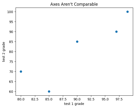
If you’re scattering comparable variables, you might get a misleading picture if you let matplotlib choose the scale.
Code
test_1_grades = [ 99, 90, 85, 97, 80]test_2_grades = [100, 85, 60, 90, 70]plt.scatter(test_1_grades, test_2_grades)plt.title("Axes Aren't Comparable")plt.xlabel("test 1 grade")plt.ylabel("test 2 grade")# save the plot as a PNG fileplt.savefig('im/viz_scatterplot_axes_not_comparable.png')plt.show()
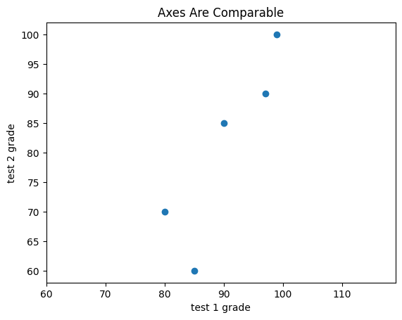
If we include a call to plt.axis("equal"), the plot more accurately shows that most of the variation occurs on test 2.
Code
test_1_grades = [99, 90, 85, 97, 80]test_2_grades = [100, 85, 60, 90, 70]plt.scatter(test_1_grades, test_2_grades)plt.title("Axes Are Comparable")plt.axis("equal")plt.xlabel("test 1 grade")plt.ylabel("test 2 grade")# save the plot as a PNG fileplt.savefig('im/viz_scatterplot_axes_comparable.png')plt.show()
For Further Exploration
Matplotlib Gallery will give you a good idea of the sorts of things you can do with matplotlib (and how to do them).
Seaborn is a higher-level visualization library built on top of matplotlib that provides a more user-friendly interface and additional features for creating attractive and informative statistical graphics.
Altair is a declarative statistical visualization library for Python. It allows you to create complex visualizations with concise and expressive code.
Plotly is another popular visualization library that allows for interactive and web-based visualizations. It provides a wide range of chart types and customization options.
D3.js is a JavaScript library for creating interactive and dynamic visualizations on the web. While it is not a Python library, it is widely used for data visualization and can be integrated with Python using libraries like Bokeh or Dash.
1.2.2 Linear Algebra
Vectors
A vector is a mathematical object that represents both magnitude (size) and direction. In data science, we think of vectors as ordered lists of numbers that can represent data points, features, or measurements. Geometrically, a vector can be visualized as an arrow pointing from the origin to a specific point in space.
Vectors are fundamental building blocks in linear algebra and essential for: - Storing and manipulating data - Representing features in machine learning - Performing mathematical operations on datasets - Computing distances and similarities between data points
A vector has countless practical applications. In physics, a vector is often thought of as a direction and magnitude. In math, it is a direction and scale on an XY plane, kind of like a movement. In computer science, it is an array of numbers storing data. The computer science context is the one we will become the most familiar with as data science professionals.
Mathematical Notation:
We represent vectors using lowercase letters with arrows: \(\vec{v}\), \(\vec{w}\), or in column form:
Unit Vector: A vector with magnitude (length) equal to 1
Zero Vector: A vector where all components are zero \[\vec{0} = \begin{bmatrix} 0 \\ 0 \\ 0 \end{bmatrix}\]
To emphasize again, the purpose of the vector is to visually represent a piece of data. If you have a data record for the square footage of a house 18,000 square feet and its valuation $260,000, we could express that as a vector [18000, 2600000], stepping 18,000 steps in the horizontal direction and 260,000 steps in the vertical direction.
We can declare a vector mathematically like this:
\(\vec{v} = \begin{bmatrix} 3 , 2 \end{bmatrix}\)
We can declare a vector using a simple Python collection, like a Python list:
Code
v = [3, 2]print(v)
[3, 2]
However, when we start doing mathematical computations with vectors, especially when doing tasks like machine learning, we should probably use the numpy library as it is more efficient than plain Python. You can also use sympy to perform linear algebra operations; however, numpy is what you will likely use in practice so that is what we will mainly stick to. To declare a vector, you can use NumPy’s array() function and then can pass a collection of numbers to it
Code
import numpy as np# Creating a basic 2D vectorv = np.array([3, 3])print("2D Vector:")print(f"v = {v}")print(f"Type: {type(v)}")print(f"Shape: {v.shape}")print(f"Dimension: {v.ndim}")
# Vector indexing and slicingdata = np.array([10, 20, 30, 40, 50, 60])print(f"Original vector: {data}")# Access single elementsprint(f"First element: {data[0]}")print(f"Last element: {data[-1]}")print(f"Third element: {data[2]}")# Slicingprint(f"First three elements: {data[:3]}")print(f"Last two elements: {data[-2:]}")print(f"Middle elements: {data[2:4]}")print(f"Every second element: {data[::2]}")# Boolean indexingmask = data >30print(f"Elements greater than 30: {data[mask]}")# Find indices where condition is trueindices = np.where(data >30)print(f"Indices where data > 30: {indices[0]}")
Original vector: [10 20 30 40 50 60]
First element: 10
Last element: 60
Third element: 30
First three elements: [10 20 30]
Last two elements: [50 60]
Middle elements: [30 40]
Every second element: [10 30 50]
Elements greater than 30: [40 50 60]
Indices where data > 30: [3 4 5]
Range vector: [0 2 4 6 8]
Linear space: [0.   0.25 0.5  0.75 1.  ]
Random integers: [7 4 8 5 7]
Random normal: [-0.91682684 -0.12414718 -2.01096289 -0.49280342  0.39257975]
From list: [1.5 2.7 3.1 4.8 5.2]
Manipulating Data Is Manipulating Vectors: Every data operation can be thought of in terms of vectors, even simple averages. Take scaling, for example. Let’s say we were trying to get the average house value and average square footage for an entire neighborhood. We would add the vectors together to combine their value and square footage respectively, giving us one giant vector containing both total value and total square footage. We then scale down the vector by dividing by the number of houses N , which really is multiplying by 1/ N . We now have a vector containing the average house value and average square footage.
Code
# Vector operations for data analysis# Sales data over 6 monthssales_q1 = np.array([10000, 12000, 15000]) # Jan, Feb, Marsales_q2 = np.array([18000, 20000, 22000]) # Apr, May, Junprint("Sales Data:")print(f"Q1 Sales: {sales_q1}")print(f"Q2 Sales: {sales_q2}")# Calculate quarterly growthgrowth = sales_q2 - sales_q1print(f"Monthly Growth: {growth}")# Calculate growth percentagegrowth_percentage = (growth / sales_q1) *100print(f"Growth Percentage: {growth_percentage}%")# Total sales for each quarterq1_total = np.sum(sales_q1)q2_total = np.sum(sales_q2)print(f"\nQ1 Total: ${q1_total:,}")print(f"Q2 Total: ${q2_total:,}")# Average monthly salesq1_avg = np.mean(sales_q1)q2_avg = np.mean(sales_q2)print(f"Q1 Average: ${q1_avg:,.0f}")print(f"Q2 Average: ${q2_avg:,.0f}")
A matrix is a rectangular array of numbers arranged in rows and columns. Matrices are fundamental structures in linear algebra and serve as powerful tools for representing and manipulating data in data science. Think of a matrix as a collection of vectors arranged side by side, or as a way to organize data in a tabular format.
Mathematically, we represent a matrix using capital letters like \(A\), \(B\), or \(M\). A matrix with \(m\) rows and \(n\) columns is called an \(m \times n\) matrix:
In data science, matrices are everywhere. A dataset with multiple features for multiple observations is essentially a matrix where each row represents an observation and each column represents a feature.
Types of Matrices
Square Matrix: A matrix where the number of rows equals the number of columns (\(n \times n\)).
A determinant is a scalar value that can be calculated from a square matrix. It provides important information about the matrix’s properties and has numerous applications in linear algebra, geometry, and data science. The determinant tells us whether a matrix is invertible, how it transforms areas and volumes, and is crucial for solving systems of linear equations.
Mathematical Notation: For a square matrix \(A\), we denote its determinant as \(\det(A)\) or \(|A|\).
Key Properties of Determinants: - Only square matrices have determinants - If \(\det(A) = 0\), the matrix is singular (non-invertible) - If \(\det(A) \neq 0\), the matrix is invertible - The determinant represents the scaling factor of the linear transformation - For a 2D matrix, it represents the area scaling factor; for 3D, the volume scaling factor
Geometric Interpretation: The absolute value of the determinant tells us how much the matrix scales areas (in 2D) or volumes (in 3D). A negative determinant indicates that the transformation reverses orientation.
Applications in Data Science: - Checking if a system of equations has a unique solution - Computing matrix inverses - Principal Component Analysis (PCA) - Measuring multicollinearity in regression analysis - Volume calculations in high-dimensional spaces
Code
# Calculate determinant of a 2x2 matrixA_2x2 = np.array([[1, 2], [2, 5]])det_A = np.linalg.det(A_2x2)print("2x2 Matrix:")print(A_2x2)print(f"Determinant: {det_A}")# Manual calculation for 2x2: ad - bcmanual_det = A_2x2[0,0] * A_2x2[1,1] - A_2x2[0,1] * A_2x2[1,0]print(f"Manual calculation: {manual_det}")
# Singular matrix (determinant = 0)singular_matrix = np.array([[1, 2, 3], [2, 4, 6], [1, 1, 1]])det_singular = np.linalg.det(singular_matrix)print("Singular Matrix (rows are linearly dependent):")print(singular_matrix)print(f"Determinant: {det_singular:.10f}") # Should be very close to 0# This matrix is not invertibletry: inverse = np.linalg.inv(singular_matrix)except np.linalg.LinAlgError as e:print(f"Cannot invert: {e}")
# Practical example: Checking system solvability# System of equations: # 2x + 3y = 7# 4x + 6y = 14# Coefficient matrixcoeff_matrix = np.array([[2, 3], [4, 6]])# Constants vectorconstants = np.array([7, 14])det_coeff = np.linalg.det(coeff_matrix)print("Coefficient Matrix:")print(coeff_matrix)print(f"Determinant: {det_coeff}")ifabs(det_coeff) <1e-10: # Close to zeroprint("System has no unique solution (infinite solutions or no solution)")# Check if system is consistent augmented = np.column_stack([coeff_matrix, constants]) rank_coeff = np.linalg.matrix_rank(coeff_matrix) rank_augmented = np.linalg.matrix_rank(augmented)if rank_coeff == rank_augmented:print("System has infinite solutions")else:print("System has no solution")else:print("System has a unique solution") solution = np.linalg.solve(coeff_matrix, constants)print(f"Solution: x = {solution[0]}, y = {solution[1]}")
Coefficient Matrix:
[[2 3]
 [4 6]]
Determinant: 0.0
System has no unique solution (infinite solutions or no solution)
System has infinite solutions
Eigenvectors and Eigenvalues
Eigenvectors and eigenvalues are fundamental concepts in linear algebra that reveal the intrinsic properties of linear transformations. They are crucial for understanding how matrices act on vectors and have profound applications in data science, particularly in dimensionality reduction, principal component analysis (PCA), and machine learning.
Mathematical Definition:
For a square matrix \(A\), an eigenvector \(\vec{v}\) is a non-zero vector that, when multiplied by \(A\), results in a scalar multiple of itself:
\[A\vec{v} = \lambda\vec{v}\]
Where: - \(\vec{v}\) is the eigenvector (direction that doesn’t change) - \(\lambda\) (lambda) is the eigenvalue (scaling factor) - \(A\) is the square matrix
Geometric Interpretation:
When a matrix transforms a vector, most vectors change both direction and magnitude. However, eigenvectors are special - they only change in magnitude (scaled by the eigenvalue) but maintain their direction. Think of it as finding the “natural” directions of a transformation.
Key Properties: - A matrix can have multiple eigenvector-eigenvalue pairs - Eigenvectors corresponding to different eigenvalues are orthogonal - The eigenvalues tell us how much the matrix stretches or shrinks in each eigenvector direction - If eigenvalue λ > 1: stretching, if 0 < λ < 1: shrinking, if λ < 0: reflection
Applications in Data Science: - Principal Component Analysis (PCA): Finding directions of maximum variance - Dimensionality Reduction: Identifying most important features - Google PageRank: Ranking web pages using eigenvectors - Image Compression: Using eigenfaces for face recognition - Stability Analysis: Determining system behavior in dynamic models - Spectral Clustering: Graph-based clustering algorithms
Code
# Basic example: Finding eigenvalues and eigenvectorsA = np.array([[3, 1], [0, 2]])# Calculate eigenvalues and eigenvectorseigenvalues, eigenvectors = np.linalg.eig(A)print("Matrix A:")print(A)print(f"\nEigenvalues: {eigenvalues}")print(f"Eigenvectors:\n{eigenvectors}")# Verify the eigenvalue equation: Av = λvfor i inrange(len(eigenvalues)): v = eigenvectors[:, i] # i-th eigenvector lambda_val = eigenvalues[i] # i-th eigenvalue Av = A @ v lambda_v = lambda_val * vprint(f"\nEigenvector {i+1}: {v}")print(f"A * v = {Av}")print(f"λ * v = {lambda_v}")print(f"Are they equal? {np.allclose(Av, lambda_v)}")
Matrix A:
[[3 1]
 [0 2]]

Eigenvalues: [3. 2.]
Eigenvectors:
[[ 1.         -0.70710678]
 [ 0.          0.70710678]]

Eigenvector 1: [1. 0.]
A * v = [3. 0.]
λ * v = [3. 0.]
Are they equal? True

Eigenvector 2: [-0.70710678  0.70710678]
A * v = [-1.41421356  1.41421356]
λ * v = [-1.41421356  1.41421356]
Are they equal? True
Code
# Symmetric matrix example (real eigenvalues, orthogonal eigenvectors)S = np.array([[4, 2], [2, 3]])eigenvals_s, eigenvecs_s = np.linalg.eig(S)print("Symmetric Matrix S:")print(S)print(f"Eigenvalues: {eigenvals_s}")print(f"Eigenvectors:\n{eigenvecs_s}")# Check orthogonality of eigenvectorsdot_product = np.dot(eigenvecs_s[:, 0], eigenvecs_s[:, 1])print(f"\nDot product of eigenvectors: {dot_product:.10f}")print(f"Eigenvectors are orthogonal: {abs(dot_product) <1e-10}")
# Practical example: Principal Component Analysis (PCA) basicsnp.random.seed(42)# Generate correlated 2D datan_samples =100x1 = np.random.normal(0, 2, n_samples)x2 =1.5* x1 + np.random.normal(0, 1, n_samples)data = np.column_stack([x1, x2])print("Original data shape:", data.shape)# Center the datadata_centered = data - np.mean(data, axis=0)# Calculate covariance matrixcov_matrix = np.cov(data_centered.T)print("Covariance Matrix:")print(cov_matrix)# Find principal components (eigenvectors of covariance matrix)eigenvals_pca, eigenvecs_pca = np.linalg.eig(cov_matrix)# Sort by eigenvalue (descending order)idx = np.argsort(eigenvals_pca)[::-1]eigenvals_pca = eigenvals_pca[idx]eigenvecs_pca = eigenvecs_pca[:, idx]print(f"\nPrincipal Component eigenvalues: {eigenvals_pca}")print(f"Principal Component eigenvectors:\n{eigenvecs_pca}")# The first eigenvector is the direction of maximum varianceprint(f"\nFirst PC explains {eigenvals_pca[0]/(eigenvals_pca[0]+eigenvals_pca[1])*100:.1f}% of variance")print(f"Second PC explains {eigenvals_pca[1]/(eigenvals_pca[0]+eigenvals_pca[1])*100:.1f}% of variance")
Original data shape: (100, 2)
Covariance Matrix:
[[3.29907957 4.71231098]
 [4.71231098 7.62348838]]

Principal Component eigenvalues: [10.64597323  0.27659473]
Principal Component eigenvectors:
[[-0.53989052 -0.84173525]
 [-0.84173525  0.53989052]]

First PC explains 97.5% of variance
Second PC explains 2.5% of variance
For Further Exploration
3Blue1Brown’s Linear Algebra Series provides intuitive visual explanations of linear algebra concepts, including eigenvectors and eigenvalues.
1.2.3 Probability and Statistics
Probability and statistics form the mathematical foundation of data science. While probability helps us model uncertainty and make predictions about future events, statistics provides tools to analyze data, test hypotheses, and draw meaningful conclusions. These concepts are essential for exploratory data analysis, hypothesis testing, and building robust machine learning models.
Key Areas We’ll Cover: - Basic probability concepts and distributions - Descriptive statistics and data summarization - Statistical inference and hypothesis testing - Bayes’ theorem and its applications - Correlation and causation - Statistical distributions commonly used in data science
Understanding these concepts is crucial for: - Exploratory Data Analysis (EDA): Summarizing and visualizing data patterns - Statistical Inference: Making conclusions about populations from samples - Machine Learning: Understanding model assumptions and uncertainty - Risk Assessment: Quantifying uncertainty in business decisions
Basic Probability Concepts
Probability is a measure of the likelihood that an event will occur, expressed as a number between 0 and 1, where: - 0 means the event is impossible - 1 means the event is certain - 0.5 means the event has equal chances of occurring or not
Key Definitions:
Sample Space (S): The set of all possible outcomes of an experiment - Rolling a dice: S = \(\{1, 2, 3, 4, 5, 6\}\) - Flipping a coin: S = \(\{Heads, Tails\}\)
Event (E): A subset of the sample space - Rolling an even number: E = \(\{2, 4, 6\}\) - Getting heads: E = \(\{Heads\}\)
Probability of an Event: P(E) = (Number of favorable outcomes) / (Total number of possible outcomes)
Fundamental Rules: 1. Addition Rule: P(A ∪ B) = P(A) + P(B) - P(A ∩ B) 2. Multiplication Rule: P(A ∩ B) = P(A) × P(B|A) 3. Complement Rule: P(A’) = 1 - P(A)
Conditional Probability: P(A|B) = P(A ∩ B) / P(B) The probability of event A given that event B has occurred.
Independence: Two events A and B are independent if P(A|B) = P(A) Or equivalently: P(A ∩ B) = P(A) × P(B)
Code
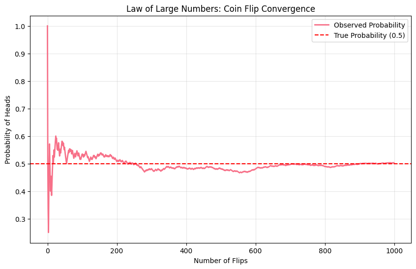
import pandas as pdimport seaborn as snsfrom scipy import stats# Set style for better visualizationsplt.style.use('default')sns.set_palette("husl")# Basic probability examplesnp.random.seed(42)# Simulate coin flipsn_flips =1000coin_flips = np.random.choice(['Heads', 'Tails'], n_flips, p=[0.5, 0.5])# Calculate probabilitiesheads_count = np.sum(coin_flips =='Heads')prob_heads = heads_count / n_flipsprint("Coin Flip Simulation:")print(f"Number of flips: {n_flips}")print(f"Heads: {heads_count}")print(f"Tails: {n_flips - heads_count}")print(f"Probability of Heads: {prob_heads:.3f}")print(f"Expected Probability: 0.500")# Visualize convergence to true probabilitycumulative_prob = np.cumsum(coin_flips =='Heads') / np.arange(1, n_flips +1)plt.figure(figsize=(10, 6))plt.plot(cumulative_prob, linewidth=2, label='Observed Probability')plt.axhline(y=0.5, color='red', linestyle='--', label='True Probability (0.5)')plt.xlabel('Number of Flips')plt.ylabel('Probability of Heads')plt.title('Law of Large Numbers: Coin Flip Convergence')plt.legend()plt.grid(True, alpha=0.3)plt.savefig('im/probability_convergence.png', dpi=150, bbox_inches='tight')plt.show()
Coin Flip Simulation:
Number of flips: 1000
Heads: 503
Tails: 497
Probability of Heads: 0.503
Expected Probability: 0.500
Code
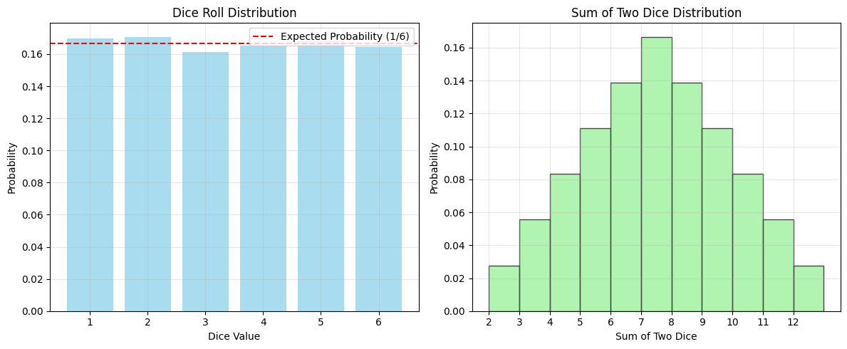
# Dice rolling example - multiple eventsn_rolls =10000dice_rolls = np.random.randint(1, 7, n_rolls)# Calculate various probabilitiesprob_even = np.sum(dice_rolls %2==0) / n_rollsprob_greater_4 = np.sum(dice_rolls >4) / n_rollsprob_1_or_6 = np.sum((dice_rolls ==1) | (dice_rolls ==6)) / n_rollsprint("Dice Rolling Simulation:")print(f"Number of rolls: {n_rolls}")print(f"P(Even number): {prob_even:.3f} (Expected: 0.500)")print(f"P(> 4): {prob_greater_4:.3f} (Expected: 0.333)")print(f"P(1 or 6): {prob_1_or_6:.3f} (Expected: 0.333)")# Visualize dice roll distributionplt.figure(figsize=(12, 5))plt.subplot(1, 2, 1)values, counts = np.unique(dice_rolls, return_counts=True)plt.bar(values, counts/n_rolls, alpha=0.7, color='skyblue')plt.axhline(y=1/6, color='red', linestyle='--', label='Expected Probability (1/6)')plt.xlabel('Dice Value')plt.ylabel('Probability')plt.title('Dice Roll Distribution')plt.legend()plt.grid(True, alpha=0.3)plt.subplot(1, 2, 2)two_dice = []for i inrange(1, 7):for j inrange(1, 7): two_dice.append(i + j)plt.hist(two_dice, bins=range(2, 14), density=True, alpha=0.7, color='lightgreen', edgecolor='black')plt.xlabel('Sum of Two Dice')plt.ylabel('Probability')plt.title('Sum of Two Dice Distribution')plt.xticks(range(2, 13))plt.grid(True, alpha=0.3)plt.tight_layout()plt.savefig('im/dice_probability.png', dpi=150, bbox_inches='tight')plt.show()# Calculate P(sum = 7)sum_7_count =len([x for x in two_dice if x ==7])prob_sum_7 = sum_7_count /len(two_dice)print(f"\nP(Sum = 7 with two dice): {prob_sum_7:.3f}")
Dice Rolling Simulation:
Number of rolls: 10000
P(Even number): 0.501 (Expected: 0.500)
P(> 4): 0.333 (Expected: 0.333)
P(1 or 6): 0.334 (Expected: 0.333)
P(Sum = 7 with two dice): 0.167
Descriptive Statistics
Descriptive statistics help us summarize and understand the main characteristics of a dataset. They provide insight into the center, spread, and shape of data distributions.
Measures of Central Tendency:
Mean (μ or x̄): The arithmetic average \[\bar{x} = \frac{1}{n}\sum_{i=1}^{n} x_i\]
Median: The middle value when data is ordered - Robust to outliers - Better than mean for skewed distributions
Mode: The most frequently occurring value(s)
Measures of Dispersion:
Variance (σ² or s²): Average of squared differences from the mean \[\sigma^2 = \frac{1}{n}\sum_{i=1}^{n} (x_i - \mu)^2\]
Standard Deviation (σ or s): Square root of variance \[\sigma = \sqrt{\sigma^2}\]
Range: Difference between maximum and minimum values
Interquartile Range (IQR): Difference between 75th and 25th percentiles - Q3 - Q1 - Measures spread of middle 50% of data
Measures of Shape:
Skewness: Measure of asymmetry - Positive skew: tail extends to the right - Negative skew: tail extends to the left
Kurtosis: Measure of tail heaviness - High kurtosis: heavy tails, more outliers - Low kurtosis: light tails, fewer outliers
Code
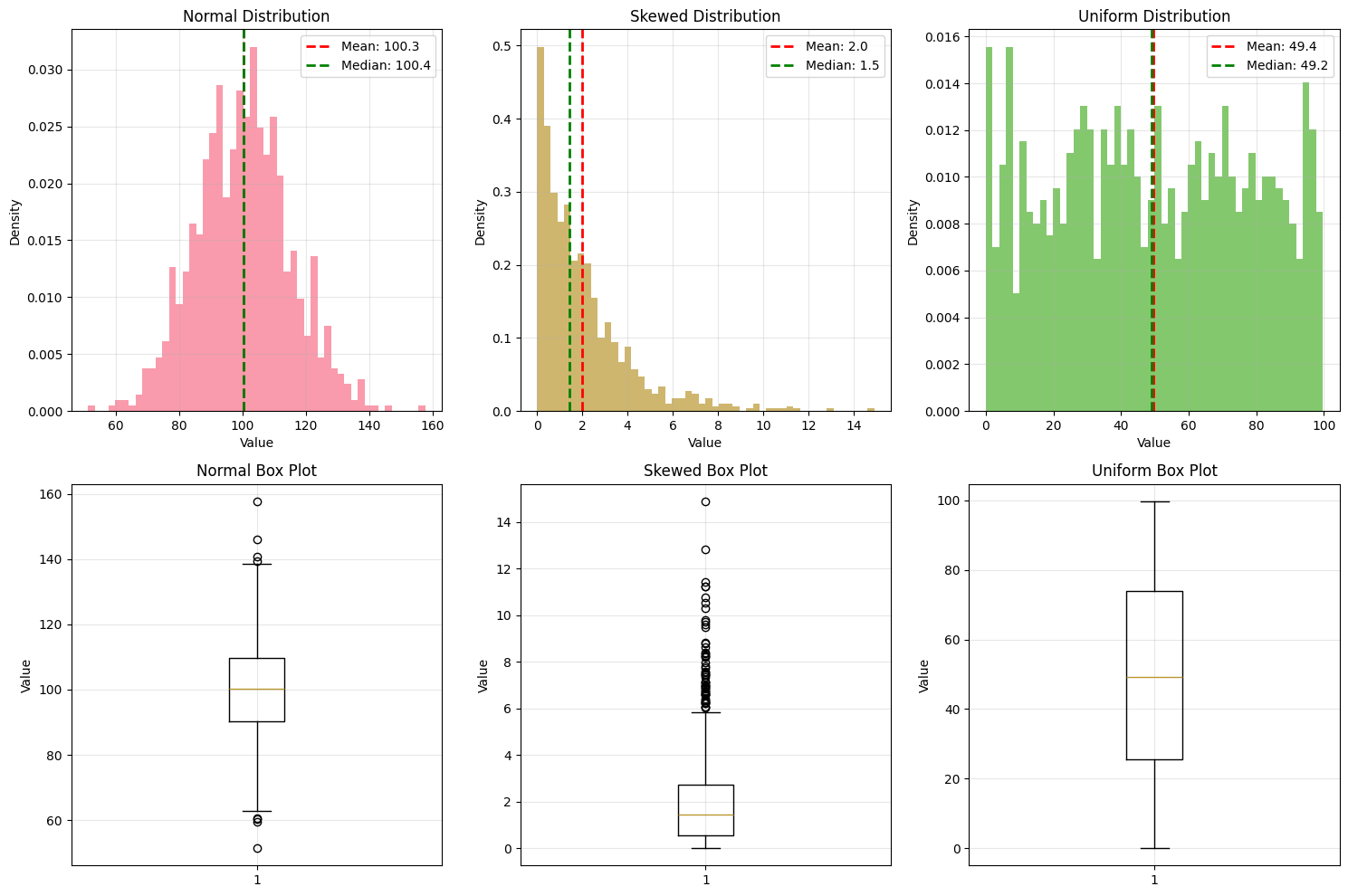
# Generate sample datasets for statistical analysisnp.random.seed(42)# Create different types of distributionsnormal_data = np.random.normal(100, 15, 1000) # Mean=100, std=15skewed_data = np.random.exponential(2, 1000) # Exponential distributionuniform_data = np.random.uniform(0, 100, 1000) # Uniform distribution# Create a DataFramedf = pd.DataFrame({'Normal': normal_data,'Skewed': skewed_data,'Uniform': uniform_data})print("Descriptive Statistics Summary:")print("="*50)print(df.describe())# Calculate additional statisticsprint("\nAdditional Statistics:")print("="*30)for col in df.columns: data = df[col]print(f"\n{col} Distribution:")print(f" Median: {np.median(data):.2f}")print(f" Mode: {stats.mode(data)[0]:.2f}")print(f" Variance: {np.var(data, ddof=1):.2f}")print(f" Skewness: {stats.skew(data):.2f}")print(f" Kurtosis: {stats.kurtosis(data):.2f}")print(f" IQR: {np.percentile(data, 75) - np.percentile(data, 25):.2f}")
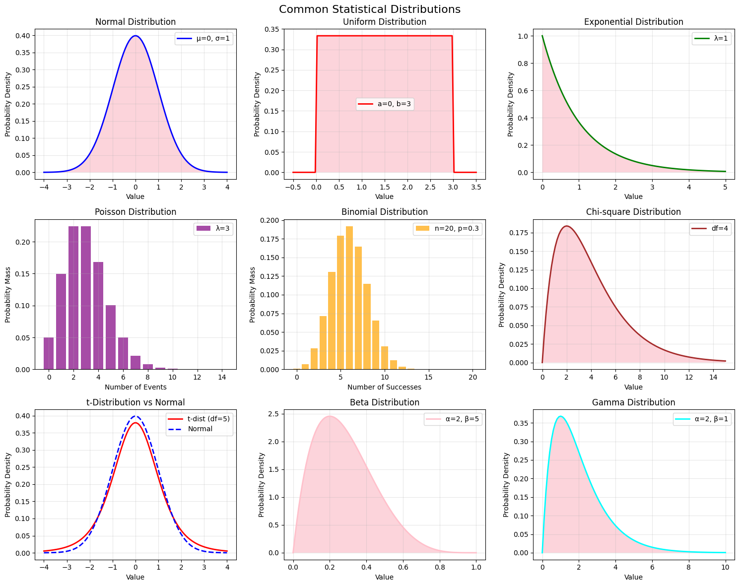
Statistical distributions are mathematical functions that describe the probability of different outcomes in a dataset. Understanding common distributions is crucial for data analysis and modeling.
Normal Distribution (Gaussian) - Bell-shaped, symmetric distribution - Defined by mean (μ) and standard deviation (σ) - 68-95-99.7 rule (empirical rule) - Many natural phenomena follow normal distribution
Properties: - Mean = Median = Mode - 68% of data within 1σ of mean - 95% of data within 2σ of mean
- 99.7% of data within 3σ of mean
Other Important Distributions:
Uniform Distribution: All outcomes equally likely
Exponential Distribution: Models time between events
Poisson Distribution: Models count of events in fixed intervals
Binomial Distribution: Models number of successes in n trials
Chi-square Distribution: Used in hypothesis testing
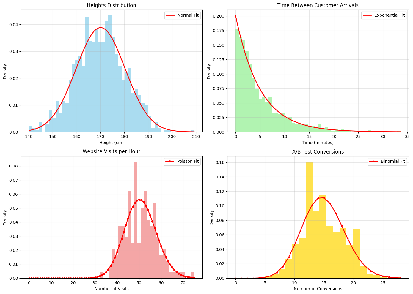
# Real-world applications of distributions with simulated dataprint("Distribution Applications in Data Science:")print("="*50)# 1. Normal Distribution - Height dataheights = np.random.normal(170, 10, 1000) # Heights in cmprint(f"Height Data (Normal Distribution):")print(f" Mean height: {np.mean(heights):.1f} cm")print(f" Std deviation: {np.std(heights):.1f} cm")print(f" % between 160-180 cm: {np.sum((heights >=160) & (heights <=180))/len(heights)*100:.1f}%")# 2. Exponential Distribution - Time between customer arrivalsarrival_times = np.random.exponential(5, 1000) # Average 5 minutes between arrivalsprint(f"\nCustomer Arrival Times (Exponential Distribution):")print(f" Average time between arrivals: {np.mean(arrival_times):.1f} minutes")print(f" % of arrivals within 2 minutes: {np.sum(arrival_times <=2)/len(arrival_times)*100:.1f}%")# 3. Poisson Distribution - Number of website visits per hourvisits_per_hour = np.random.poisson(50, 24*7) # 50 average visits per hour for a weekprint(f"\nWebsite Visits (Poisson Distribution):")print(f" Average visits per hour: {np.mean(visits_per_hour):.1f}")print(f" Max visits in an hour: {np.max(visits_per_hour)}")print(f" Hours with >60 visits: {np.sum(visits_per_hour >60)}")# 4. Binomial Distribution - A/B Testing# 100 users, 15% conversion rateconversions = np.random.binomial(100, 0.15, 1000) # 1000 experimentsprint(f"\nA/B Test Conversions (Binomial Distribution):")print(f" Average conversions per 100 users: {np.mean(conversions):.1f}")print(f" 95% confidence interval: [{np.percentile(conversions, 2.5):.0f}, {np.percentile(conversions, 97.5):.0f}]")# Visualize these applicationsfig, axes = plt.subplots(2, 2, figsize=(14, 10))# Heightsaxes[0, 0].hist(heights, bins=50, density=True, alpha=0.7, color='skyblue')x_heights = np.linspace(heights.min(), heights.max(), 100)axes[0, 0].plot(x_heights, stats.norm.pdf(x_heights, np.mean(heights), np.std(heights)), 'r-', linewidth=2, label='Normal Fit')axes[0, 0].set_title('Heights Distribution')axes[0, 0].set_xlabel('Height (cm)')axes[0, 0].set_ylabel('Density')axes[0, 0].legend()axes[0, 0].grid(True, alpha=0.3)# Arrival timesaxes[0, 1].hist(arrival_times, bins=50, density=True, alpha=0.7, color='lightgreen')x_arrivals = np.linspace(0, arrival_times.max(), 100)axes[0, 1].plot(x_arrivals, stats.expon.pdf(x_arrivals, scale=np.mean(arrival_times)), 'r-', linewidth=2, label='Exponential Fit')axes[0, 1].set_title('Time Between Customer Arrivals')axes[0, 1].set_xlabel('Time (minutes)')axes[0, 1].set_ylabel('Density')axes[0, 1].legend()axes[0, 1].grid(True, alpha=0.3)# Website visitsx_visits = np.arange(0, visits_per_hour.max()+1)axes[1, 0].hist(visits_per_hour, bins=30, density=True, alpha=0.7, color='lightcoral')axes[1, 0].plot(x_visits, stats.poisson.pmf(x_visits, np.mean(visits_per_hour)), 'ro-', linewidth=2, markersize=4, label='Poisson Fit')axes[1, 0].set_title('Website Visits per Hour')axes[1, 0].set_xlabel('Number of Visits')axes[1, 0].set_ylabel('Density')axes[1, 0].legend()axes[1, 0].grid(True, alpha=0.3)# Conversionsx_conv = np.arange(0, conversions.max()+1)axes[1, 1].hist(conversions, bins=20, density=True, alpha=0.7, color='gold')axes[1, 1].plot(x_conv, stats.binom.pmf(x_conv, 100, np.mean(conversions)/100), 'ro-', linewidth=2, markersize=3, label='Binomial Fit')axes[1, 1].set_title('A/B Test Conversions')axes[1, 1].set_xlabel('Number of Conversions')axes[1, 1].set_ylabel('Density')axes[1, 1].legend()axes[1, 1].grid(True, alpha=0.3)plt.tight_layout()plt.savefig('im/distribution_applications.png', dpi=150, bbox_inches='tight')plt.show()
Distribution Applications in Data Science:
==================================================
Height Data (Normal Distribution):
  Mean height: 170.1 cm
  Std deviation: 10.3 cm
  % between 160-180 cm: 65.7%

Customer Arrival Times (Exponential Distribution):
  Average time between arrivals: 5.0 minutes
  % of arrivals within 2 minutes: 33.4%

Website Visits (Poisson Distribution):
  Average visits per hour: 50.7
  Max visits in an hour: 75
  Hours with >60 visits: 14

A/B Test Conversions (Binomial Distribution):
  Average conversions per 100 users: 14.9
  95% confidence interval: [9, 22]
Bayes’ Theorem
Bayes’ theorem is a fundamental principle in probability theory that describes how to update the probability of a hypothesis based on new evidence. It’s the foundation of Bayesian statistics and has numerous applications in machine learning, medical diagnosis, spam filtering, and decision-making.
Mathematical Formula:
\[P(A|B) = \frac{P(B|A) \times P(A)}{P(B)}\]
Where: - P(A|B): Posterior probability - probability of A given B - P(B|A): Likelihood - probability of B given A
- P(A): Prior probability - initial probability of A - P(B): Marginal probability - total probability of B
In words:Posterior = (Likelihood × Prior) / Evidence
Key Components:
Prior P(A): Our initial belief about the probability of A before seeing evidence
Likelihood P(B|A): How likely we are to observe evidence B if A is true
Evidence P(B): Total probability of observing evidence B
Posterior P(A|B): Updated probability of A after observing evidence B
Applications in Data Science: - Medical Diagnosis: Update disease probability based on test results - Spam Detection: Classify emails based on word patterns - Machine Learning: Naive Bayes classifier
Code
# Bayes' Theorem Examplesprint("Bayes' Theorem Applications")print("="*40)# Example 1: Medical Diagnosisprint("Example 1: Medical Diagnosis")print("-"*30)# Disease affects 1% of populationprior_disease =0.01prior_no_disease =1- prior_disease# Test accuracy: 95% sensitivity, 90% specificitysensitivity =0.95# P(Test+ | Disease)specificity =0.90# P(Test- | No Disease)false_positive_rate =1- specificity # P(Test+ | No Disease)# Evidence: P(Test+)evidence_test_positive = (sensitivity * prior_disease) + (false_positive_rate * prior_no_disease)# Posterior: P(Disease | Test+)posterior_disease_given_positive = (sensitivity * prior_disease) / evidence_test_positiveprint(f"Prior probability of disease: {prior_disease:.1%}")print(f"Test sensitivity: {sensitivity:.1%}")print(f"Test specificity: {specificity:.1%}")print(f"Probability of positive test: {evidence_test_positive:.1%}")print(f"Probability of disease given positive test: {posterior_disease_given_positive:.1%}")# Example 2: Spam Detectionprint(f"\nExample 2: Spam Detection")print("-"*30)# Prior probabilitiesprior_spam =0.3# 30% of emails are spamprior_ham =0.7# 70% of emails are legitimate# Likelihood of word "free" appearinglikelihood_free_given_spam =0.8# 80% of spam contains "free"likelihood_free_given_ham =0.1# 10% of legitimate emails contain "free"# Evidence: P("free")evidence_free = (likelihood_free_given_spam * prior_spam) + (likelihood_free_given_ham * prior_ham)# Posterior: P(Spam | "free")posterior_spam_given_free = (likelihood_free_given_spam * prior_spam) / evidence_freeprint(f"Prior probability of spam: {prior_spam:.1%}")print(f"P('free' | spam): {likelihood_free_given_spam:.1%}")print(f"P('free' | legitimate): {likelihood_free_given_ham:.1%}")print(f"P(spam | 'free'): {posterior_spam_given_free:.1%}")
Bayes' Theorem Applications
========================================
Example 1: Medical Diagnosis
------------------------------
Prior probability of disease: 1.0%
Test sensitivity: 95.0%
Test specificity: 90.0%
Probability of positive test: 10.8%
Probability of disease given positive test: 8.8%

Example 2: Spam Detection
------------------------------
Prior probability of spam: 30.0%
P('free' | spam): 80.0%
P('free' | legitimate): 10.0%
P(spam | 'free'): 77.4%
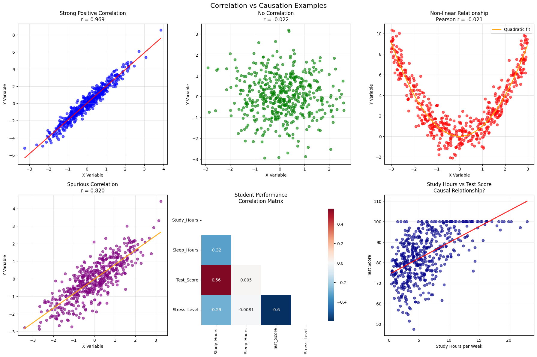
Correlation and Causation
Understanding the relationship between variables is crucial in data analysis. Correlation measures the strength and direction of a linear relationship between two variables, while causation implies that one variable directly influences another.
Key Principle: “Correlation does not imply causation”
Interpretation: - r = +1: Perfect positive correlation - r = 0: No linear correlation
- r = -1: Perfect negative correlation - |r| > 0.7: Strong correlation - 0.3 < |r| < 0.7: Moderate correlation - |r| < 0.3: Weak correlation
Types of Relationships: 1. No relationship: Variables are independent 2. Linear relationship: Variables change at a constant rate 3. Non-linear relationship: Variables are related but not linearly 4. Spurious correlation: Variables appear related due to confounding factors
Establishing Causation: 1. Temporal precedence: Cause must precede effect 2. Covariation: Cause and effect must be correlated 3. Non-spuriousness: Relationship isn’t due to third variable 4. Mechanism: Logical explanation for how cause leads to effect
Correlation Analysis Examples:
========================================
1. Linear relationship: r = 0.969
2. No relationship: r = -0.022
3. Non-linear relationship: r = -0.021
4. Spurious correlation: r = 0.820
Student Performance Correlations:
-----------------------------------
Study_Hours vs Sleep_Hours: r = -0.323
Study_Hours vs Test_Score: r = 0.556
Study_Hours vs Stress_Level: r = -0.288
Sleep_Hours vs Test_Score: r = 0.005
Sleep_Hours vs Stress_Level: r = -0.008
Test_Score vs Stress_Level: r = -0.600
For Further Exploration
Check out these resources to deepen your understanding of probability and statistics: